Sporting events
College bands / music
Student council / student reps
End of year events
Achievements / prize winners
Enrichment activities
College productions
Guest speakers
Sexual health advice
Preliminary task consists of;
Medium close up shot of a student
Main article of one of the above
Create masthead
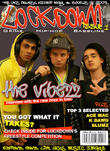
Boy wins Channel U freestyle award.
(Picture of friend in front of a microphone while spitting some bars).
Friday, 30 January 2009
What is a college magazine?
Posted by Jamie Galligan at 04:46 0 comments
Thursday, 29 January 2009
Blog Title
Add your block code (E1) to your blog title please Jamie.
Posted by TRC Media at 12:09 0 comments
Tuesday, 27 January 2009
Well done!
Hi Jamie,
Your blog is looking really good - excellent presentation.
Your analysis is extremely good - very detailed and you have clearly attempted to analyse the form and conventions of Kerrang - you now need to scan them in and upload them for me.
Vic and Rob
Posted by TRC Media at 11:59 0 comments
Monday, 26 January 2009
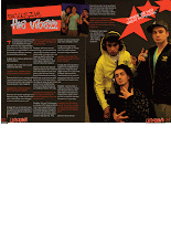
Double page spread.
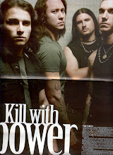
I have chosen to write about the double page spread on pages 22-23 which is about the band Trivium. The spread is set over both pages vertically as it emphasises the size of the band members. The 1st page has little text which only includes the photographers and reporters names which are set in the top left corner and the name of the band included in the top right corner.
All the band members’ faces are in the top half. They all have serious faces which connote them being manly and show that they are serious about their image. They are all wearing dark clothes some with long hair, tattoos and jewellery with represents the rock image. One of the band members is stood in the middle with his body turned to the side wearing a tight t-shirt to draw attention to his muscular build. They are set in front of a pale filthy looking wall which connotes them as being underground.
In the middle of the bottom page slightly aligned to the left is the heading for the article. It reads “Kill with power” in big lettering with the word power in larger letters to draw attention as it is a keyword in the phrase and connotes the band to be powerful. It has a subheading underneath this in smaller letters with brief information of the band itself and an introduction to the article.
The article is in really small letters with the 1st couple of words in a slightly smaller size to draw attention. It is located right down at the bottom of the bottom page aligned right to the right hand side. This is so the image can be seen more clearly as there are no relevant parts of the image in this particular space.
Posted by Jamie Galligan at 08:05 0 comments
Friday, 23 January 2009
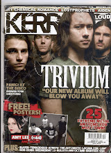
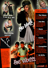
Contents page.
The contents page consists of the issue number at the top left with the date for that particular issue. There is a small grey border around the text which draws attention to it as the rest of the page has a black background. The headline for the page says contents in big capital letters in a rugged stencilled spray paint style which matches the style of the masthead on the front cover. There are four images of artists under the headline the 1st with a short article on the band Trivium and a picture of the editor with his signature and job title underneath the article. The other 3 images include their names at the bottom part of the image with the number of the page they are in. The texts included in the images are in stencil format.
The subheading under the images says “THIS WEEK” and follows the same spray painted style as the page heading and masthead on the front cover. This has blue lines printed behind the text which matches the colour scheme for its subheadings on the page. Underneath are the subheadings containing information of the actual contents. These are separated into categories each with different subheadings in blue to separate them from the information underneath which are written in a smaller text in white.
At the bottom of the page is an image of a band represented as being fun easy going men all smiling chilled out with one of them smoking. They are all dressed in rock star style clothing all wearing dark shades with lots of jewellery and one of them covered in tattoos. Just above the image to the right of one of the band members heads in a text saying Party dudes in capital letters making it easier to read and draws attention with the page number they are included in typed in a smaller size.
Positioned at the very bottom of the page is an advertisement for the Kerrang subscription with the main meaning of the ad Following the blue colour scheme with exclamation marks to draw attention with images of past issues of the magazine which is relevant to the advertisement as it shows the reader what the advertisement is about 1st without them actually reading it. Underneath the main text are details of how to get your subscription in a smaller text and written in white to separate it from the above.
Posted by Jamie Galligan at 04:40 0 comments
Thursday, 22 January 2009
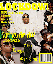
Front cover.
The front cover consists of a masthead saying “KERRANG” the name of the magazine with an exclamation mark to make it stand out and connote volume. It has lines through the lettering and smudged parts to make it look as if it has been spray painted using a stencil such as on the cargo boxes used for rock bands equipment. The masthead is set to the back with an image of the band Trivium overlapping it. This draws attention to the image. Also Trivium is written in big letters in a gothic font and a subheading saying what the article is about over the actual image to show the viewer that that is the band shown.
At the top of the page are names of bands included in the issue which are separated by stars. In terms of music these stars connote glamour, fame and success. The writing is white with a black out line which helps it stand out. The colour scheme throughout the whole front cover is black white and red which connotes death and danger to enhance the metal/rock look.
Near the bottom of the cover on the left is a subheading advertising the free posters included in the magazine. This is helped to stand out by its ragged red background which has the effect it has been painted on in a graffiti style. It is also typed in block capitals with exclamation marks which connotes loudness.
Posted by Jamie Galligan at 01:53 0 comments
Subscribe to:
Comments (Atom)

.gif)