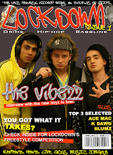
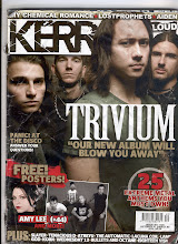
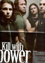
The front cover consists of a masthead saying “KERRANG” the name of the magazine with an exclamation mark to make it stand out and connote volume. It has lines through the lettering and smudged parts to make it look as if it has been spray painted using a stencil such as on the cargo boxes used for rock bands equipment. The masthead is set to the back with an image of the band Trivium overlapping it. This draws attention to the image. Also Trivium is written in big letters in a gothic font and a subheading saying what the article is about over the actual image to show the viewer that that is the band shown.
At the top of the page are names of bands included in the issue which are separated by stars. In terms of music these stars connote glamour, fame and success. The writing is white with a black out line which helps it stand out. The colour scheme throughout the whole front cover is black white and red which connotes death and danger to enhance the metal/rock look.
Near the bottom of the cover on the left is a subheading advertising the free posters included in the magazine. This is helped to stand out by its ragged red background which has the effect it has been painted on in a graffiti style. It is also typed in block capitals with exclamation marks which connotes loudness.
Thursday, 22 January 2009
Front cover.
Posted by Jamie Galligan at 01:53
Subscribe to:
Post Comments (Atom)

.gif)


0 comments:
Post a Comment