1.In what ways does your media product use, develop or challenge forms and conventions of real media products?
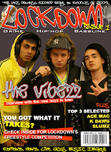
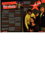
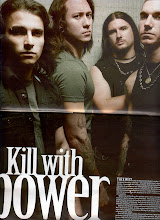
I created my cover from the inspiration of a Niche magazine called Hip-Hop connection. This magazine like mine focuses on the UK Hip-Hop industry. I created my magazine to have a similar look by copying some of the same conventions. I looked at some Hip-Hop connection covers on the internet to try and find one I could use some ideas from. I found one with three different artists on the cover which I found more interesting than some of the others with only one on. Also it has some small text above the masthead which I thought looked effective so I used this idea on mine.
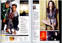
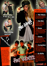
For my contents I looked at a magazine called mixmag. This magazines contents page was a double page spread but I decided I preferred my contents in a single page. I used some ideas from this such as the contents text being in an individual box and including many various artists of both sexes on this page.
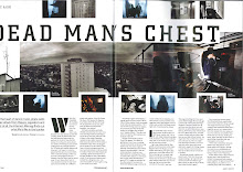
For my double page spread I also used some ideas from mixmag but I decided on making mine more unique. Instead of using many different images on it like the one I looked at in mixmag I used only two, one large one on the right page and one smaller one above the text on the left page. I used a drop capital to start my article as featured in the mixmag magazine.
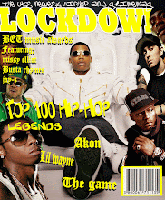
On the right are examples of Hip-Hop connection, Mixmag and my own (LockDown).
Friday, 8 May 2009
evaluation question 1.
evaluation question 2.
2. How does your media product represent particular social groups?
My magazine presents the UK gangster image as this is my target audience. I achieved this image by keeping my magazine in the same style. The artists I used all have gangster and Hip-Hop music related connotations e.g. flat-caps, hoodies, Colourful trainers and clothing, microphones and headphones.
I also used colour to give the image I wanted. Throughout the various pages I kept the background dark to represent the grimness of gangster life but in my text and images added colour which shows the artists as stars. I kept the same colour scheme for the backgrounds and texts which consisted of orange, black and white.
I also used the font of my text to portray the gangster image. For my masthead and subheading on my cover I used fonts off dafont.com. These fonts are graffiti style, I chose these as graffiti is often seen as a connotation of gangs. I kept some similar styles of writing in my contents and double page spread for headings/sub-headings etc. For my articles and contents information I used arial as it was clearer and easier to read. I did this as these texts were in a smaller size.
evaluation question 3.
3. What kind of media institution might distribute your media product and why?
I believe my magazine would be best suited for an independent company. This is because it only features UK music and is aimed at quite a niche audience. I the circulation for my magazine would be on a rather large scale as it will feature music and artists from all over the UK but it would most likely be restricted to the UK because of the fact it only features UK artists.
It would be promoted to the public by posters in Hip-Hop, Grime and Bassline style nightclubs, also by word of mouth and by the artists featured. My magazine could have a radio station which would just be available in one large area where this music is most popular. This would be the same area as the LockDown office to make it easier to track.
evaluation question 4.
4. Who would be the audience for your media product?
My target audience would be the UK gangster scene. The image of all the artists included are all set out and connoted in this style. Gangsters are often associated with Hip-Hop music and so I believe they would be most interested in LockDown magazine.
I asked some random people of different stereotypes what they thought of my magazine and it was most preferred by people representing the gangster image.

evaluation question 6.
6. What have you learnt about technologies from the process of constructing this product?
I have learned how to use various computer programmes at a higher level such as quark and Photoshop. I had never used quark before I started this project so I have learned how to use all the tools on this programme from scratch. In Photoshop I learned how to use some new tools and ones I had used before but in a more advanced way. I have also learned how to copy generic conventions of other magazines and make them work to my purpose. I have learned how to take professional looking photographs and edit them. I have also learnt how to keep track of work using an online blog.
Evaluation question 7.
7. Looking back at your preliminary task, what do you feel you have learnt in the progression from it to the full product?
I have learned how to keep track of work making sure all is complete for deadlines. I have also learned how to use new technologies and gained an experience in creating magazines using these technologies.
Thursday, 7 May 2009
Magazine industry research- Bauer
Bauer media research.
The Bauer Media Group (Bauer Verlagsgruppe) is a large German publishing company based in Hamburg, which operates in 15 countries worldwide. Since the company was founded in 1875, it has been privately-owned and under management by the Bauer family. It was formerly called Heinrich Bauer Verlag KG, abbreviated to HBV and usually shortened to H. Bauer.
It produces and distributes many popular magazines and has stakes in television and radio, recently completing the purchase of a consumer magazine division and radio station division of the British company, EMAP. [1]
Worldwide circulation of Bauer Media Group's magazine titles amount to 38 million magazines a week.[2]
Bauer Verlagsgruppe is managed by four generations of the Bauer family. Originally a small printing house, The Bauer Publishing Group has grown into a worldwide publishing company. The Bauer Publishing Group comprises 238 magazines worldwide in 15 countries, as well as TV and radio stations.

.gif)


Contents
On my contents page i used many images. This is because i wanted to provide the reader with different examples of the artists featured inside my magazine.
Example of cover image


.gif)


