2. How does your media product represent particular social groups?
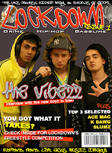
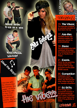
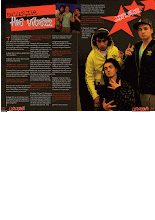
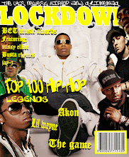
My magazine presents the UK gangster image as this is my target audience. I achieved this image by keeping my magazine in the same style. The artists I used all have gangster and Hip-Hop music related connotations e.g. flat-caps, hoodies, Colourful trainers and clothing, microphones and headphones.
I also used colour to give the image I wanted. Throughout the various pages I kept the background dark to represent the grimness of gangster life but in my text and images added colour which shows the artists as stars. I kept the same colour scheme for the backgrounds and texts which consisted of orange, black and white.
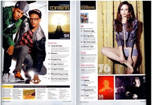
I also used the font of my text to portray the gangster image. For my masthead and subheading on my cover I used fonts off dafont.com. These fonts are graffiti style, I chose these as graffiti is often seen as a connotation of gangs. I kept some similar styles of writing in my contents and double page spread for headings/sub-headings etc. For my articles and contents information I used arial as it was clearer and easier to read. I did this as these texts were in a smaller size.
Friday, 8 May 2009
evaluation question 2.
Posted by Jamie Galligan at 07:42
Subscribe to:
Post Comments (Atom)

.gif)






0 comments:
Post a Comment