
Thursday, 17 December 2009


Wednesday, 2 December 2009
Video progress
So far in my music video we have captured all the shots needed, completed most of the editing and made a start on our second task which in based around the advertising needed for our video. We have worked outside college and inside college as well as at weekends and evening hours to gain shots needed at night time and to keep ahead of deadlines. The programme used for the editing is called adobe elements, this was new to us and we had never used it before but after a few hours in the editing suite we began to get the hang of it and are now using effects and transitions with ease aswell as picking up new skills on the way.
Monday, 9 November 2009
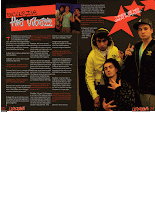
Boy better know

This is the group who created the track in which we are producing a video for. Above is the original video for it.
Progress.
So far we have had various nights of filming, we have achieved two our main shots (3 and 11) and created a few extra unplanned shots which could be used for re-establishing for use between our main shots, it also gave us more experience with handling the camera. We have booked a camera out again for this weekend and have a production schedule made so we know what shots we need to make at which individual times and what props and people we will need to make this possible.
Thursday, 5 November 2009


Wednesday, 4 November 2009


Friday, 16 October 2009
Music Video Project Treatment
BoyDem:-
Josh Jenkins – J -Star
Jamie Gilligan – G-Vibezz
Jack Green – Camera Manz
Kyle Morgan – K-Dog
Our music video is a Bassline track (Too Many Man) featuring people in a unit acting like it’s an underground club, these people will be from different areas to represents one massive movie; these areas include Rawmarsh, Whiston, Thorpe Hesley and Barnsley.
Our product is aimed at both genders (male & female) aged around 16-21 years. Our audience will be people that like Bassline type music such as Too Many Man by Sketpa, Kase & Shinobi – Ya Dirty Girl. The track will be aimed at all ethnic groups, not specified to a precise culture. The music will be aimed at listeners from all views; people don’t have to dress like “gangsters” as we all stereotype people who like this type of music to, however it is aimed at that particular social group, also I like this music but I don’t act or do what these types of lyrics speak or dress like stereotypical views would.
At the beginning of our music video there’s going to be Me (Josh Jenkins) Kyle Morgan and Jamie Gilligan standing in a hold tight position in a warehouse (underground club) with quite a lot of people inside bouncing in front of us, lights flashing and you can guess where it goes from there.
Basically our music video is going to have a warehouse located in Rawmarsh which I have access to from my uncles business, our costumes aren’t really important but we are going to be mediating the generic conventions of our target audience. The characters will mainly be me (Josh Jenkins) Kyle and Jamie, however there will be a lot of extras to help us set the mise-en-scene.
Through-out our music project we will have a wide variety of camera shots and angles, these will include close-ups of cars, Sub-woofers, featured girl and loads of others props we will be using. The types of shots expected in our project are going to range from extreme close ups to establishing shots, also from fly on the wall to point of views angled shots.
The type of sound that we will be using throughout will be non-diegetic, this is because were using the music but miming the lyrics to make it look and sound like where MC’in the music.
The warehouse I have access to is my uncles and a lot of dangerous equipment is used down there, however on the night of filming inside all health and safety precautions will have taken place, all the apparatus will be away and turned off, only props that where using. To make this more reassuring I’ve worked there and know what and what not to do.
I’ve had strong words with the people I’m trusting to come down and act as extras, no messing and being stupid will take place, if there is there leaving the premises.
Our planning is going strong and where focused on what is needed to get an A in our project, we have good effective knowledge of our final piece and hope that it goes well and looks well when looking back at it. Where hopefully going to be filming during the 26th of October – 1st November and by the end of theses dates we have a good expectation that all filming will be complete.
Thursday, 1 October 2009
Presentation of Ideas - Planning for Feedback (A03)
This is the presentation we used to present to the class to gain their feedback on our ideas.
Wednesday, 30 September 2009
Tuesday, 29 September 2009
She likes to (2009)

This video from "She likes to" feautures many of the faces of grime at the present. We would like to produce our video in this style. This is because we are working in a group of four and we would like to display ourselves on the video as well as other local talents.
TOO MANY MAN (2009) Boy Better Know
This is analysis for my A2 coursework. I am intending to produce a music video of this genre. I will upload more examples of text similar and my ideas sheet after my successful initial brainstorm session. Below is my analysis.
Ghetto - Grime mc
 This is Ghetto a grime mc. His videos are a good example of generic codes and conventions which fit the black cultured london rap star stereotype which is associated with the Grime genre e.g the video "Don't Phone me (2009)" This video is uploaded above.
Monday, 22 June 2009
lesson objective of today.
i have not fulfilled my lesson objective for today as i have not been able to upload the video as we have failed to complete the editing in this lesson. I will do this in my next lesson.
Screen play
Embarrassing Situation,
Draft 1,
18/06/09
Karen Conlon,
1) EXT. COLLEGE – DAYTIME
There is an establishing wide long shot outside college during the day at lunchtime showing students walking around. The setting is noisy and busy with natural sounds of laughing and voices.
Cut to:
2) INT. RECEPTION – LUNCHTIME
There is a master wide long shot of Person A and B in the reception in mid conversation.
Person A
So we going out this Friday then?
Person B
Yeah, I’m up for it, Pop or Liquid?
Person A
(Shouts Excitedly)
POP!
Person B
I’ll see you Friday then
There is a medium close up of the two people talking, Person A to the right and Person B to the left. Person A fiddles with her bag looking for something.
Person A
Yeah, see you Friday, Bye.
There is an extreme close up shot of the bag showing something falling out.
Medium shot – Shows item fall and camera follow it in slow motion.
Close up shot – Object on ground.
Cut to:
6) EXT. COLLEGE GROUNDS – LUNCHTIME
Camera pans and rises to medium long shot of Person A walking outside.
Cut to:
7) INT. RECEPTION – LUNCHTIME
Eye line match – Person B looking at object.
Cut to:
8) EXT. COLLEGE GROUNDS – LUNCHTIME
Close up – Person A still walking off.
Cut to:
9) INT. RECEPTION – LUNCHTIME
Long Shot – Person B bends down and picks up the object.
Insert shot to hand and object.
Medium shot as Person B stands up
Medium close up, over the shoulder shot, reaction shot- Shot reverse shot as Person B looks in their hand
Person B
Wait, you’ve dropped this.
Shot reverse shot to Person A, over the shoulder reaction shot.
Back to Person B in shot reverse shot.
Cut to:
10) EXT. OUTSIDE – LUNCHTIME
Person B walks outside and it’s a Medium long shot of both of them.
Person A
(Embarrassed Face)
Oh thanks.
Lesson objective 22/06/2009
We have completed our filming and today will be editing it and uploading our scene to our blogs.
This is in order to fulfill assessment objective 3.
Monday, 15 June 2009
Lesson objective.
Create a new post. Call your post "introduction to Unit G324: advanced portfolio - lesson objective.
1. Complete a screenplay for my introduction to unit G324 : Advanced portfolio Video task
2. Complete a storyboard for my introduction to unit G324 : Advanced portfolio Video task.
Introduction to unit G324: Advanced portfolio - assessment objectives
The purpose of this unit is firstly to assess your ability to plan and construct media products using appropriate technical and creative skills (AO3); secondly to assess your ability to apply knowledge and understanding in evaluating your own work, showing how meanings and responses are created (AO2); and finally to assess your ability to undertake, apply and present appropriate research (AO4).The unit requires you to engage with contemporary media technologies, giving you the opportunity to develop your own skills in these technologies. It also enables you to develop the skills of presentation that are required for further study at higher levels and in the workplace.
Friday, 8 May 2009
evaluation question 1.
1.In what ways does your media product use, develop or challenge forms and conventions of real media products?
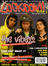
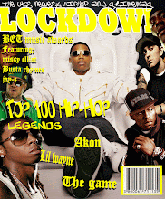
I created my cover from the inspiration of a Niche magazine called Hip-Hop connection. This magazine like mine focuses on the UK Hip-Hop industry. I created my magazine to have a similar look by copying some of the same conventions. I looked at some Hip-Hop connection covers on the internet to try and find one I could use some ideas from. I found one with three different artists on the cover which I found more interesting than some of the others with only one on. Also it has some small text above the masthead which I thought looked effective so I used this idea on mine.
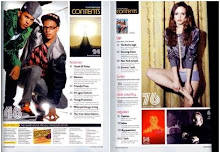
For my contents I looked at a magazine called mixmag. This magazines contents page was a double page spread but I decided I preferred my contents in a single page. I used some ideas from this such as the contents text being in an individual box and including many various artists of both sexes on this page.
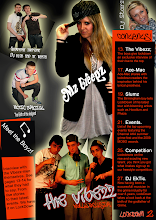
For my double page spread I also used some ideas from mixmag but I decided on making mine more unique. Instead of using many different images on it like the one I looked at in mixmag I used only two, one large one on the right page and one smaller one above the text on the left page. I used a drop capital to start my article as featured in the mixmag magazine.
On the right are examples of Hip-Hop connection, Mixmag and my own (LockDown).
evaluation question 2.
2. How does your media product represent particular social groups?
My magazine presents the UK gangster image as this is my target audience. I achieved this image by keeping my magazine in the same style. The artists I used all have gangster and Hip-Hop music related connotations e.g. flat-caps, hoodies, Colourful trainers and clothing, microphones and headphones.
I also used colour to give the image I wanted. Throughout the various pages I kept the background dark to represent the grimness of gangster life but in my text and images added colour which shows the artists as stars. I kept the same colour scheme for the backgrounds and texts which consisted of orange, black and white.
I also used the font of my text to portray the gangster image. For my masthead and subheading on my cover I used fonts off dafont.com. These fonts are graffiti style, I chose these as graffiti is often seen as a connotation of gangs. I kept some similar styles of writing in my contents and double page spread for headings/sub-headings etc. For my articles and contents information I used arial as it was clearer and easier to read. I did this as these texts were in a smaller size.
evaluation question 3.
3. What kind of media institution might distribute your media product and why?
I believe my magazine would be best suited for an independent company. This is because it only features UK music and is aimed at quite a niche audience. I the circulation for my magazine would be on a rather large scale as it will feature music and artists from all over the UK but it would most likely be restricted to the UK because of the fact it only features UK artists.
It would be promoted to the public by posters in Hip-Hop, Grime and Bassline style nightclubs, also by word of mouth and by the artists featured. My magazine could have a radio station which would just be available in one large area where this music is most popular. This would be the same area as the LockDown office to make it easier to track.
evaluation question 4.
4. Who would be the audience for your media product?
My target audience would be the UK gangster scene. The image of all the artists included are all set out and connoted in this style. Gangsters are often associated with Hip-Hop music and so I believe they would be most interested in LockDown magazine.
I asked some random people of different stereotypes what they thought of my magazine and it was most preferred by people representing the gangster image.

evaluation question 6.
6. What have you learnt about technologies from the process of constructing this product?
I have learned how to use various computer programmes at a higher level such as quark and Photoshop. I had never used quark before I started this project so I have learned how to use all the tools on this programme from scratch. In Photoshop I learned how to use some new tools and ones I had used before but in a more advanced way. I have also learned how to copy generic conventions of other magazines and make them work to my purpose. I have learned how to take professional looking photographs and edit them. I have also learnt how to keep track of work using an online blog.
Evaluation question 7.
7. Looking back at your preliminary task, what do you feel you have learnt in the progression from it to the full product?
I have learned how to keep track of work making sure all is complete for deadlines. I have also learned how to use new technologies and gained an experience in creating magazines using these technologies.
Thursday, 7 May 2009
Magazine industry research- Bauer
Bauer media research.
The Bauer Media Group (Bauer Verlagsgruppe) is a large German publishing company based in Hamburg, which operates in 15 countries worldwide. Since the company was founded in 1875, it has been privately-owned and under management by the Bauer family. It was formerly called Heinrich Bauer Verlag KG, abbreviated to HBV and usually shortened to H. Bauer.
It produces and distributes many popular magazines and has stakes in television and radio, recently completing the purchase of a consumer magazine division and radio station division of the British company, EMAP. [1]
Worldwide circulation of Bauer Media Group's magazine titles amount to 38 million magazines a week.[2]
Bauer Verlagsgruppe is managed by four generations of the Bauer family. Originally a small printing house, The Bauer Publishing Group has grown into a worldwide publishing company. The Bauer Publishing Group comprises 238 magazines worldwide in 15 countries, as well as TV and radio stations.

.gif)


Contents
On my contents page i used many images. This is because i wanted to provide the reader with different examples of the artists featured inside my magazine.
Example of cover image

This is my front cover image, i took this photo myself and brought in the props. i used a backdrop for this image to make it easier to cut out the people.
Monday, 27 April 2009

Monday, 16 March 2009
10 generic conventions of a music magazine.
1.Information on musicians/bands.
2.Images of musicians/bands
3.Information on up-coming musical events
4.3 house colours
5.Masthead
6.Relevant iconography connoting music
7.Advertisements relevant to music
8.Band/musician interviews
9.Medium shot of the artist
10.Sell lines eg, Kerrang-life is loud
Thursday, 12 March 2009
5 rules of taking a good cover image
- Rule 1 - no cluttered background
- Rule 2 - make sure you focus on the lead singer so the viewers know who the band are - If it is a single artist make sure it is a medium shot/close up
- Rule 3 - leave room for masthead without cutting off heads
- Rule 4 - no high angle shots - they make bad cover images! Fine for double page spreads but bad for covers
- Rule 5 - Animate your band. make sure they look at the camera
Lesson objective 12-03-2009
Gather some picture for my music magzine draft and make a start on the draft front cover.
Tuesday, 10 March 2009
Monday, 9 March 2009
Friday, 6 March 2009
Wow this blog is sick n wot, l really like lockdown as the title, ''sounds gangster'' blood
keep up the work badmanzzz
i love the cover, black and red looking good.
some good work, i think lockdown is the best name for your magazines
Thursday, 5 March 2009
Tuesday, 3 March 2009
Monday, 2 March 2009
Friday, 27 February 2009
Thursday, 26 February 2009

Friday, 30 January 2009
What is a college magazine?
Sporting events
College bands / music
Student council / student reps
End of year events
Achievements / prize winners
Enrichment activities
College productions
Guest speakers
Sexual health advice
Preliminary task consists of;
Medium close up shot of a student
Main article of one of the above
Create masthead
Boy wins Channel U freestyle award.
(Picture of friend in front of a microphone while spitting some bars).
Thursday, 29 January 2009
Tuesday, 27 January 2009
Well done!
Hi Jamie,
Your blog is looking really good - excellent presentation.
Your analysis is extremely good - very detailed and you have clearly attempted to analyse the form and conventions of Kerrang - you now need to scan them in and upload them for me.
Vic and Rob
Monday, 26 January 2009
Double page spread.
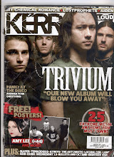
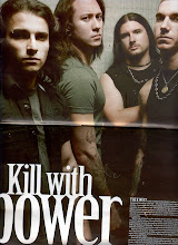
I have chosen to write about the double page spread on pages 22-23 which is about the band Trivium. The spread is set over both pages vertically as it emphasises the size of the band members. The 1st page has little text which only includes the photographers and reporters names which are set in the top left corner and the name of the band included in the top right corner.
All the band members’ faces are in the top half. They all have serious faces which connote them being manly and show that they are serious about their image. They are all wearing dark clothes some with long hair, tattoos and jewellery with represents the rock image. One of the band members is stood in the middle with his body turned to the side wearing a tight t-shirt to draw attention to his muscular build. They are set in front of a pale filthy looking wall which connotes them as being underground.
In the middle of the bottom page slightly aligned to the left is the heading for the article. It reads “Kill with power” in big lettering with the word power in larger letters to draw attention as it is a keyword in the phrase and connotes the band to be powerful. It has a subheading underneath this in smaller letters with brief information of the band itself and an introduction to the article.
The article is in really small letters with the 1st couple of words in a slightly smaller size to draw attention. It is located right down at the bottom of the bottom page aligned right to the right hand side. This is so the image can be seen more clearly as there are no relevant parts of the image in this particular space.
Friday, 23 January 2009
Contents page.
The contents page consists of the issue number at the top left with the date for that particular issue. There is a small grey border around the text which draws attention to it as the rest of the page has a black background. The headline for the page says contents in big capital letters in a rugged stencilled spray paint style which matches the style of the masthead on the front cover. There are four images of artists under the headline the 1st with a short article on the band Trivium and a picture of the editor with his signature and job title underneath the article. The other 3 images include their names at the bottom part of the image with the number of the page they are in. The texts included in the images are in stencil format.
The subheading under the images says “THIS WEEK” and follows the same spray painted style as the page heading and masthead on the front cover. This has blue lines printed behind the text which matches the colour scheme for its subheadings on the page. Underneath are the subheadings containing information of the actual contents. These are separated into categories each with different subheadings in blue to separate them from the information underneath which are written in a smaller text in white.
At the bottom of the page is an image of a band represented as being fun easy going men all smiling chilled out with one of them smoking. They are all dressed in rock star style clothing all wearing dark shades with lots of jewellery and one of them covered in tattoos. Just above the image to the right of one of the band members heads in a text saying Party dudes in capital letters making it easier to read and draws attention with the page number they are included in typed in a smaller size.
Positioned at the very bottom of the page is an advertisement for the Kerrang subscription with the main meaning of the ad Following the blue colour scheme with exclamation marks to draw attention with images of past issues of the magazine which is relevant to the advertisement as it shows the reader what the advertisement is about 1st without them actually reading it. Underneath the main text are details of how to get your subscription in a smaller text and written in white to separate it from the above.
Thursday, 22 January 2009
Front cover.
The front cover consists of a masthead saying “KERRANG” the name of the magazine with an exclamation mark to make it stand out and connote volume. It has lines through the lettering and smudged parts to make it look as if it has been spray painted using a stencil such as on the cargo boxes used for rock bands equipment. The masthead is set to the back with an image of the band Trivium overlapping it. This draws attention to the image. Also Trivium is written in big letters in a gothic font and a subheading saying what the article is about over the actual image to show the viewer that that is the band shown.
At the top of the page are names of bands included in the issue which are separated by stars. In terms of music these stars connote glamour, fame and success. The writing is white with a black out line which helps it stand out. The colour scheme throughout the whole front cover is black white and red which connotes death and danger to enhance the metal/rock look.
Near the bottom of the cover on the left is a subheading advertising the free posters included in the magazine. This is helped to stand out by its ragged red background which has the effect it has been painted on in a graffiti style. It is also typed in block capitals with exclamation marks which connotes loudness.
Subscribe to:
Comments (Atom)

.gif)


